Rooted Living
CLIENT
Rooted Living
Services
Strategy
Brand Identity
Packaging
Year
2020 – 2022
Team
Scout Studio Team
Rooted Living is a Boston-based snack company offering sustainable snacks for eco-conscious consumers. The company’s founder, Rachel Domb, noticed that the health food space lacked truly sustainable snack options, and wanted to empower consumers to snack without sacrificing their health or the planet.
We came onboard to create Rooted Living’s brand identity, design packaging for their launch product SKUs, and build out their social media presence by designing templates and initial assets.
Brand Identity Development
We started by placing ourselves into the current market through brand research – doing exercises with Rachel, our client, to learn more about Rooted Living as a brand, while also looking into competitors in the space. The next step was to take this information and create different directions based off of moodboards we showed to our client for initial gut feedback. Below are the four design strategies we came up with.
Direction 01
Hand-drawn, Raw, Organic, Hand-lettering
Direction 02
Celebratory, Warm, Vintage '60s/'70s, Textured
Direction 03
Call to Action, Message-Driven, Punchy, Attention-Grabbing
Direction 04
Clean & Crisp, Minimal, Contrasting playful details
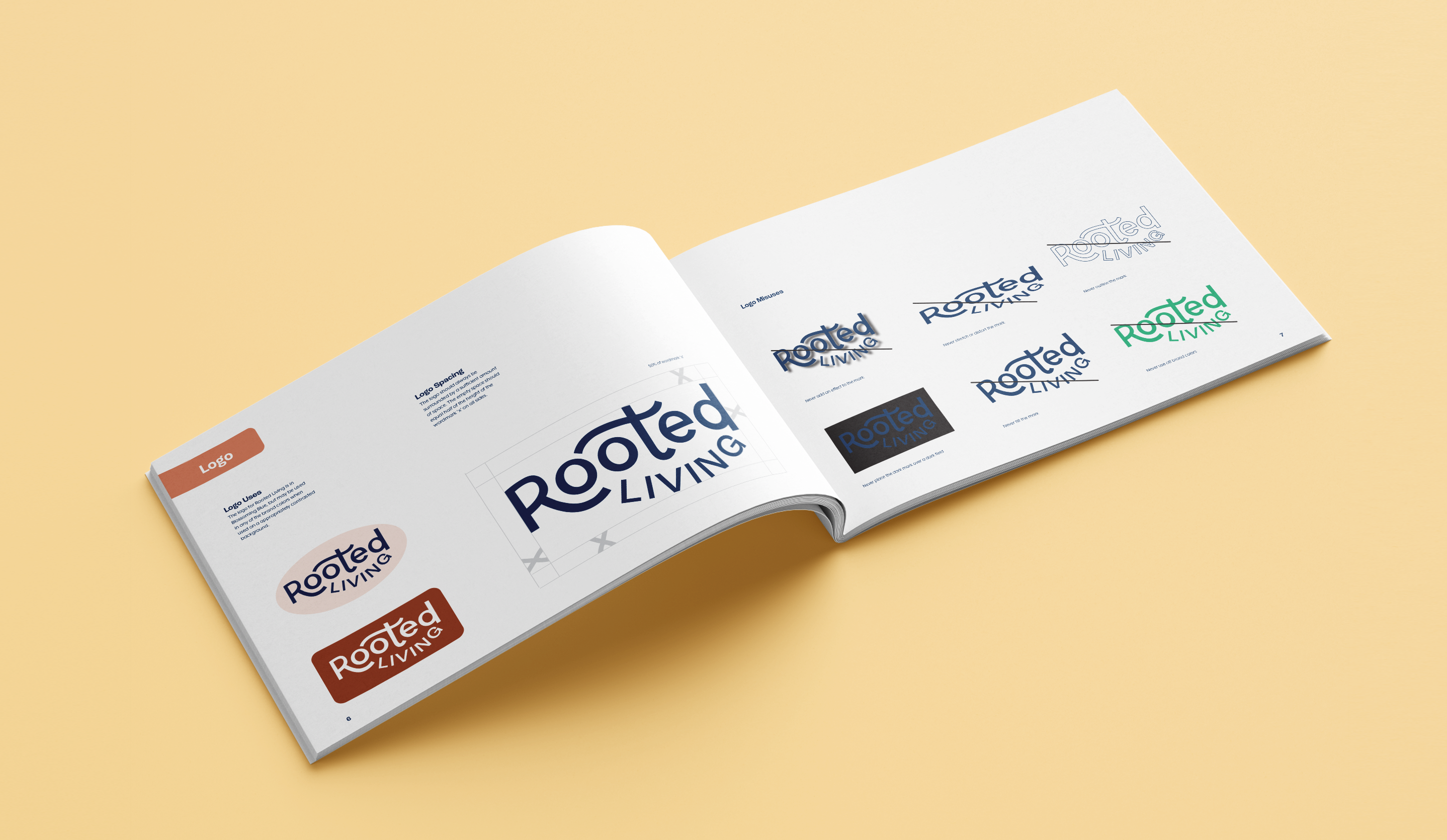
Logo & Overall Strategy
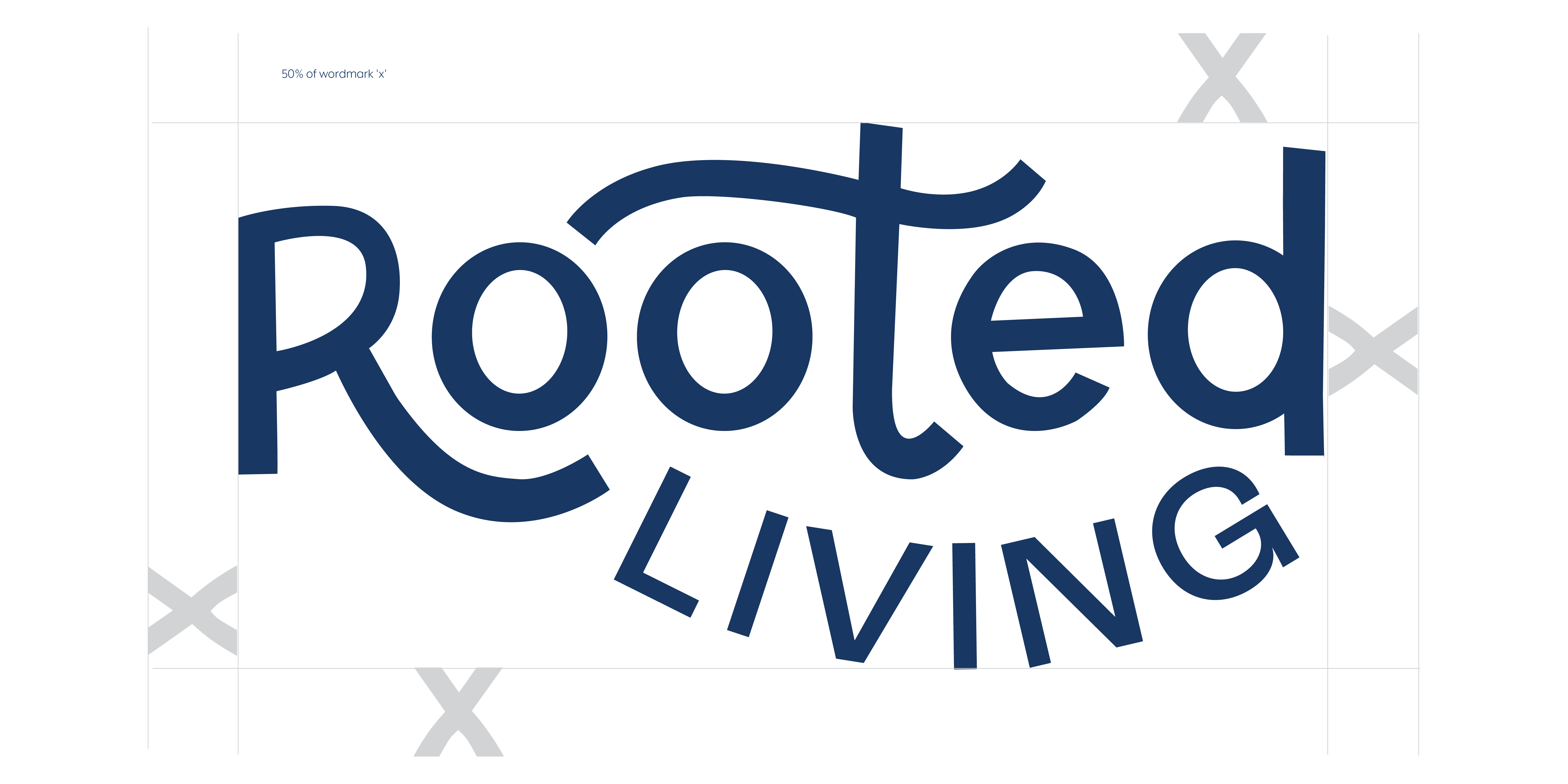
With our guidance, our client selected a strategy that she was most drawn to, and we ended up going in a direction that felt hand drawn and organic, yet still refined. We worked to straddle the line between organic and unpolished – our client did not want Rooted Living to have a “crunchy granola” feeling, that lacked sophistication and hinted at the product not being top-tier.
Typography & Color
Having a design strategy in place, we were able to define our color palette and typography. Our primary display typeface, Roc Grotesk Grotesque, provides a clean, approachable aesthetic that nods to the quirky, fun personality of the brand. We wanted a color palette that spoke to the nature and earth of it all, but was eye-catching and modern.
Illustration & Fifth Elements
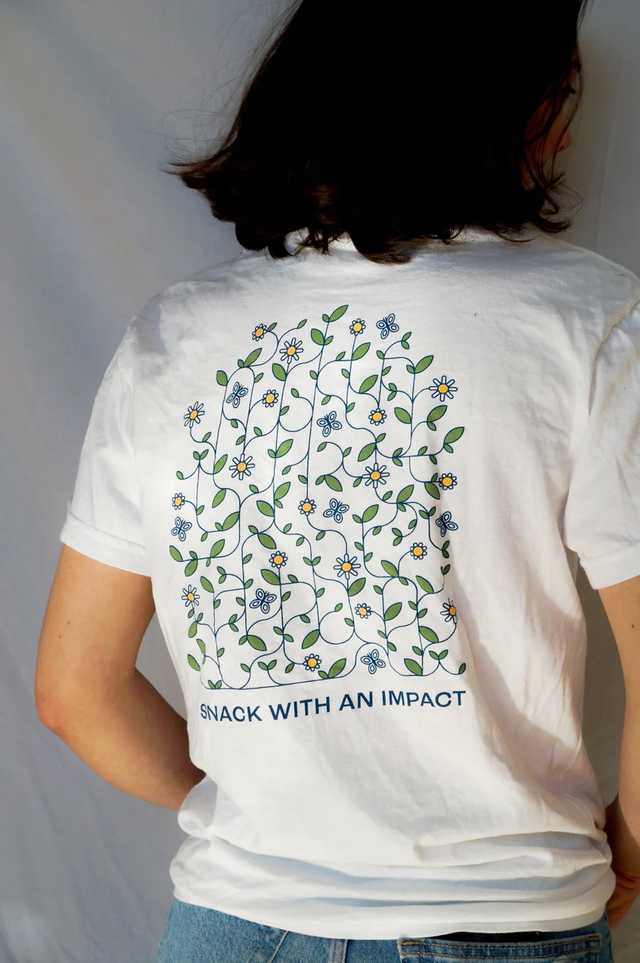
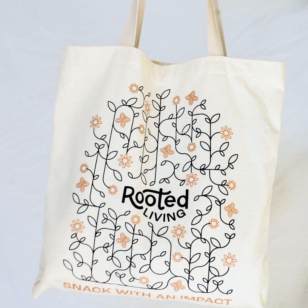
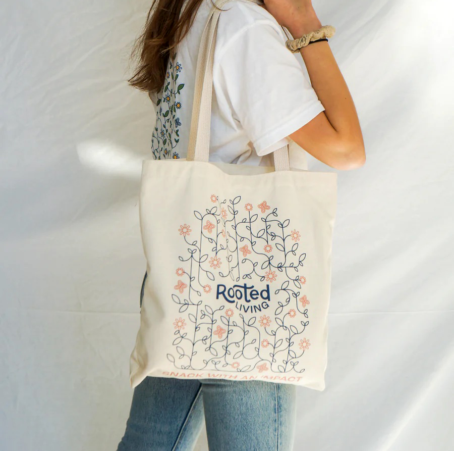
Next, we developed an illustration style and additional elements that felt in line with our chosen concept. To maintain consistency across the branding, we created a grid-based illustration system. Initially, the system felt much too rigid, until we added the elements that broke the grid to lean into the organic side (similar to the logo). We created the illusion of vine growth by curving the corners and adding leaves.
Brandbook
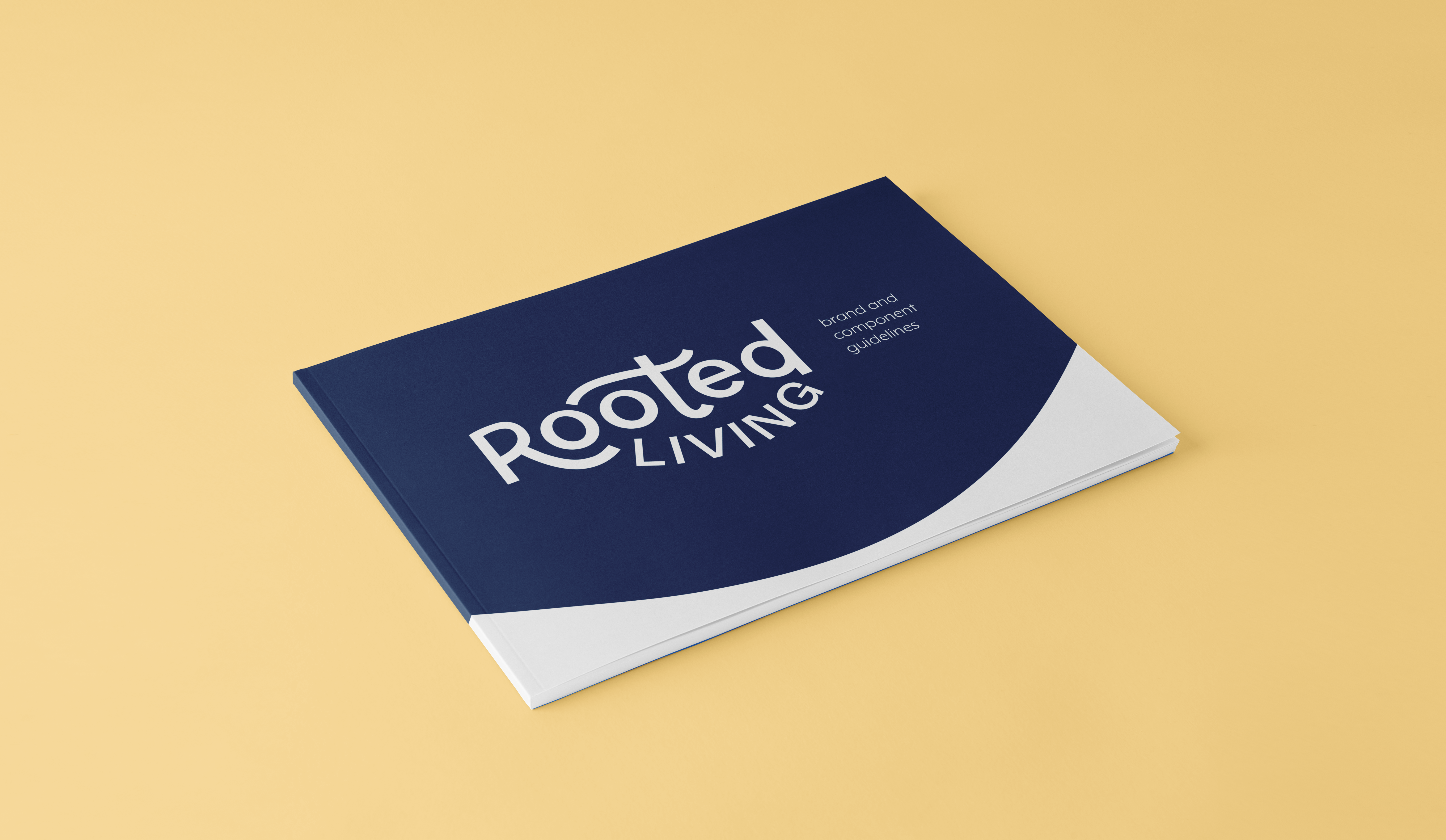
With our visual design system more or less set, we created a brand book that outlined all of Rooted Living’s design elements and how they should be used. This served as a helpful resource for our client or any other designer that might work with her in the future.
Packaging
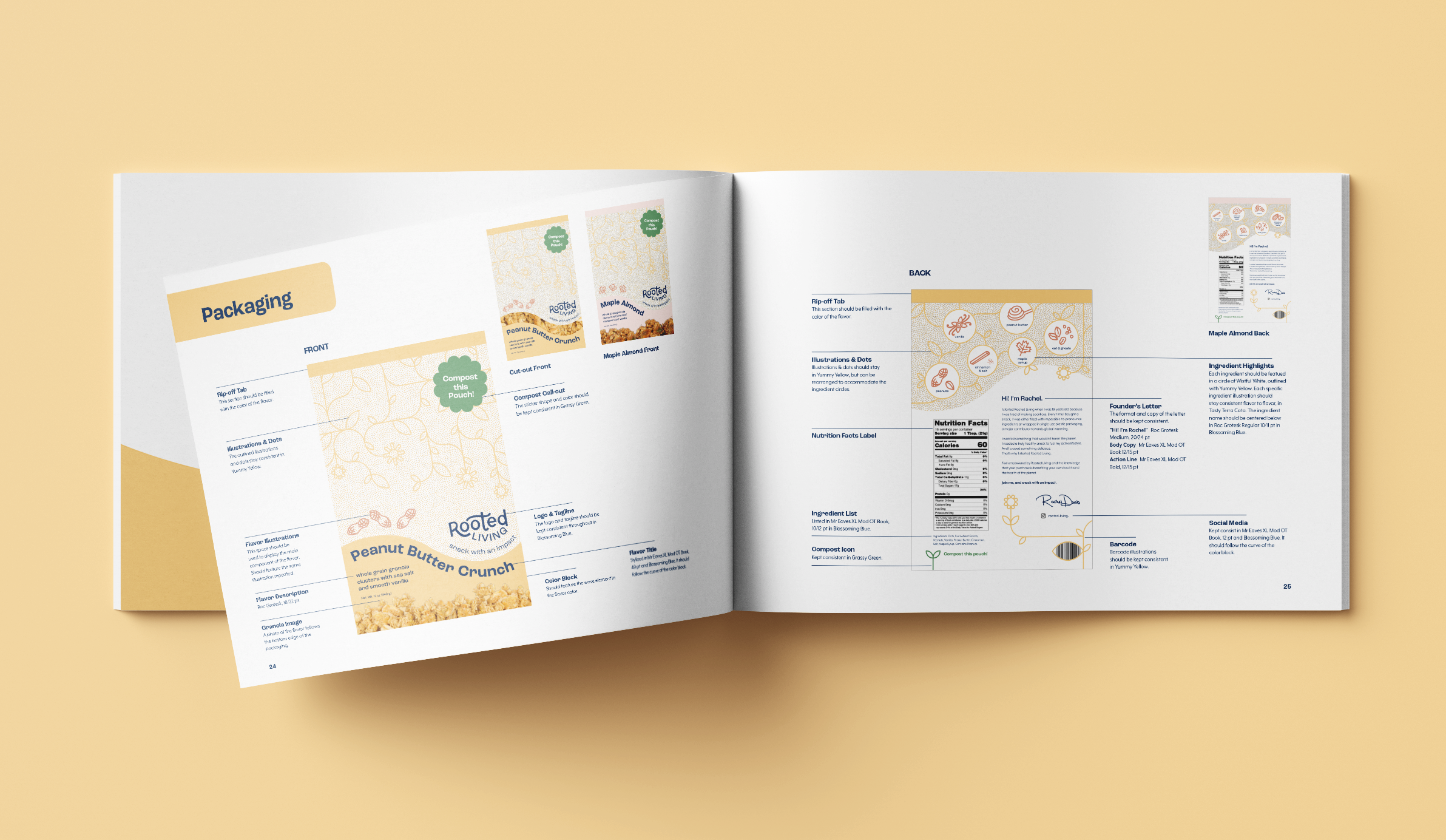
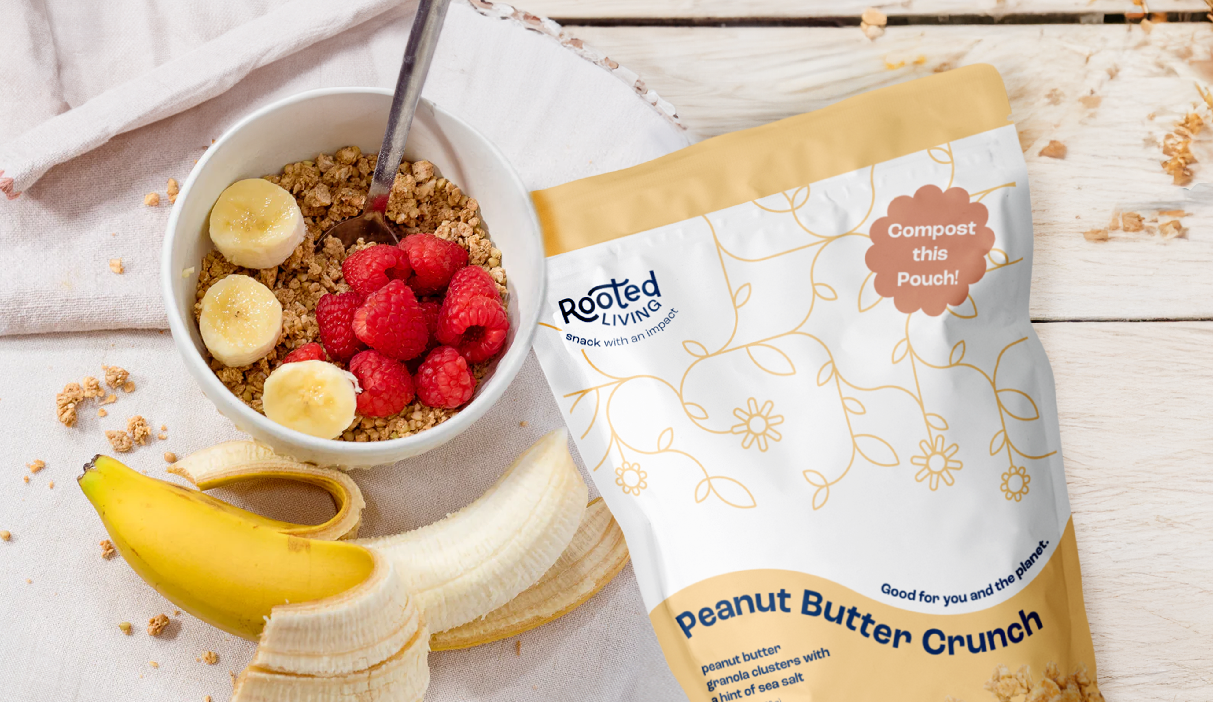
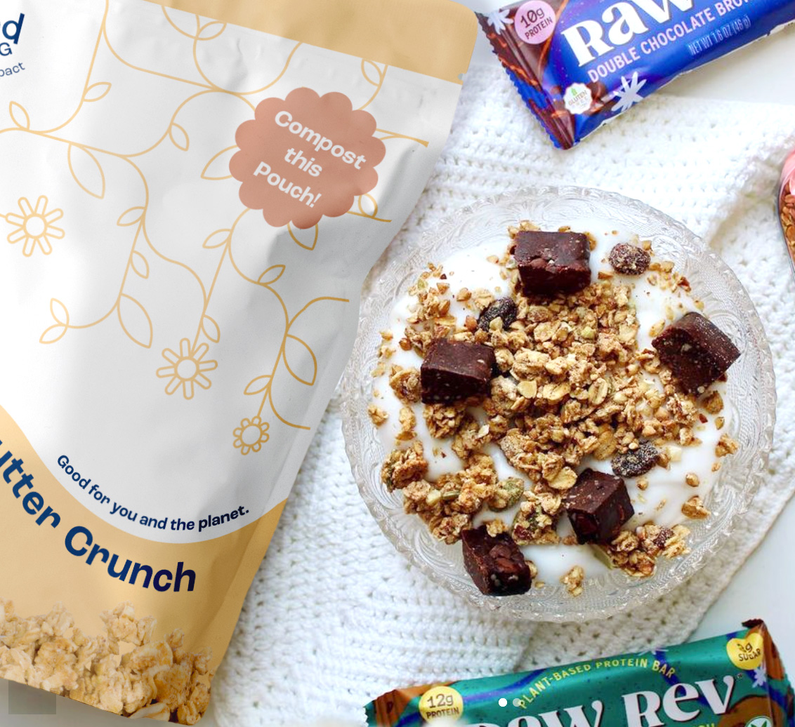
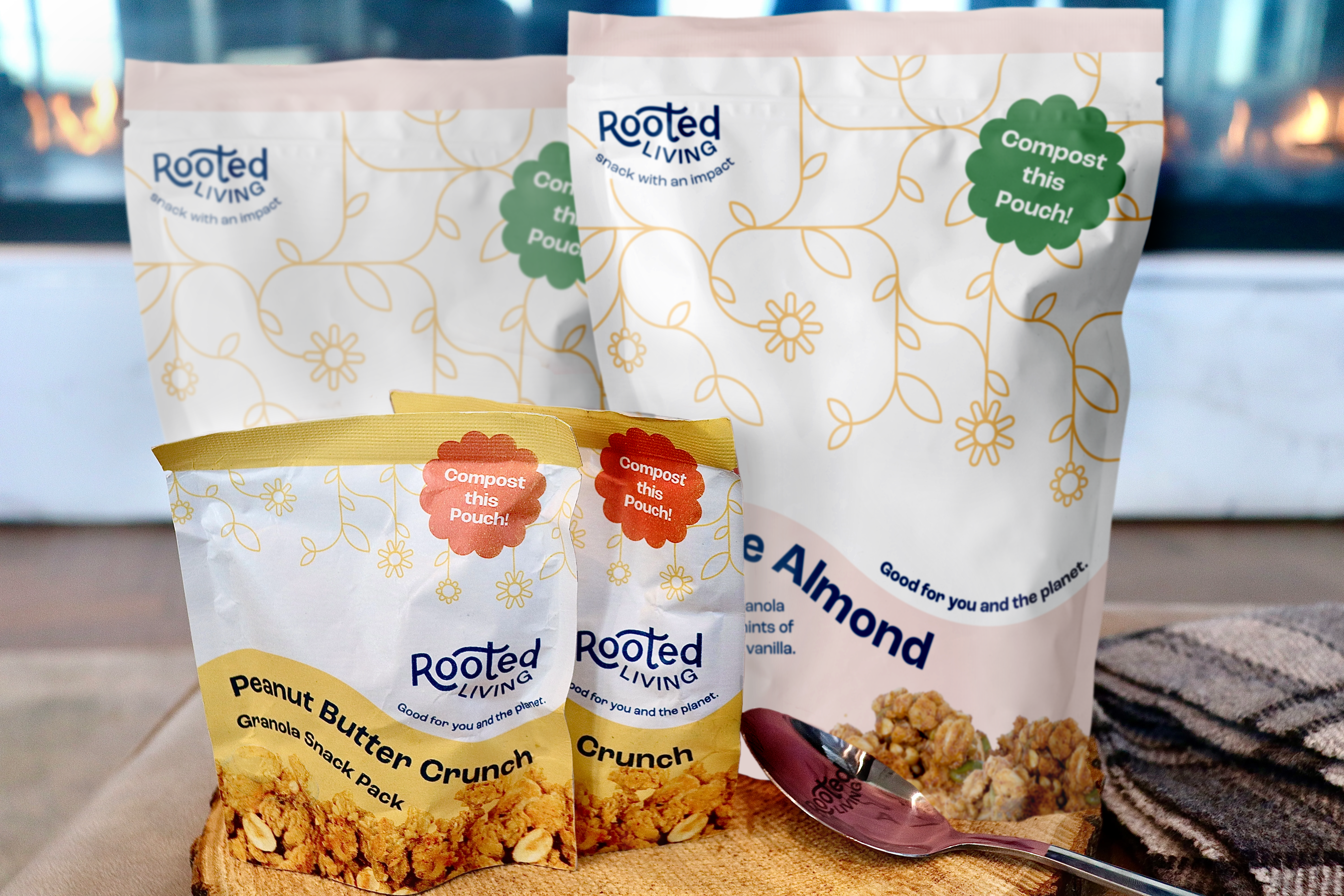
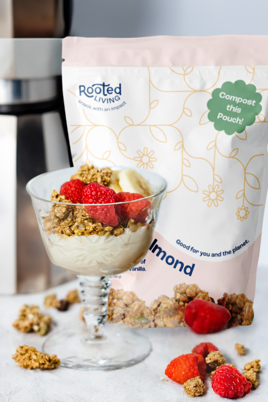
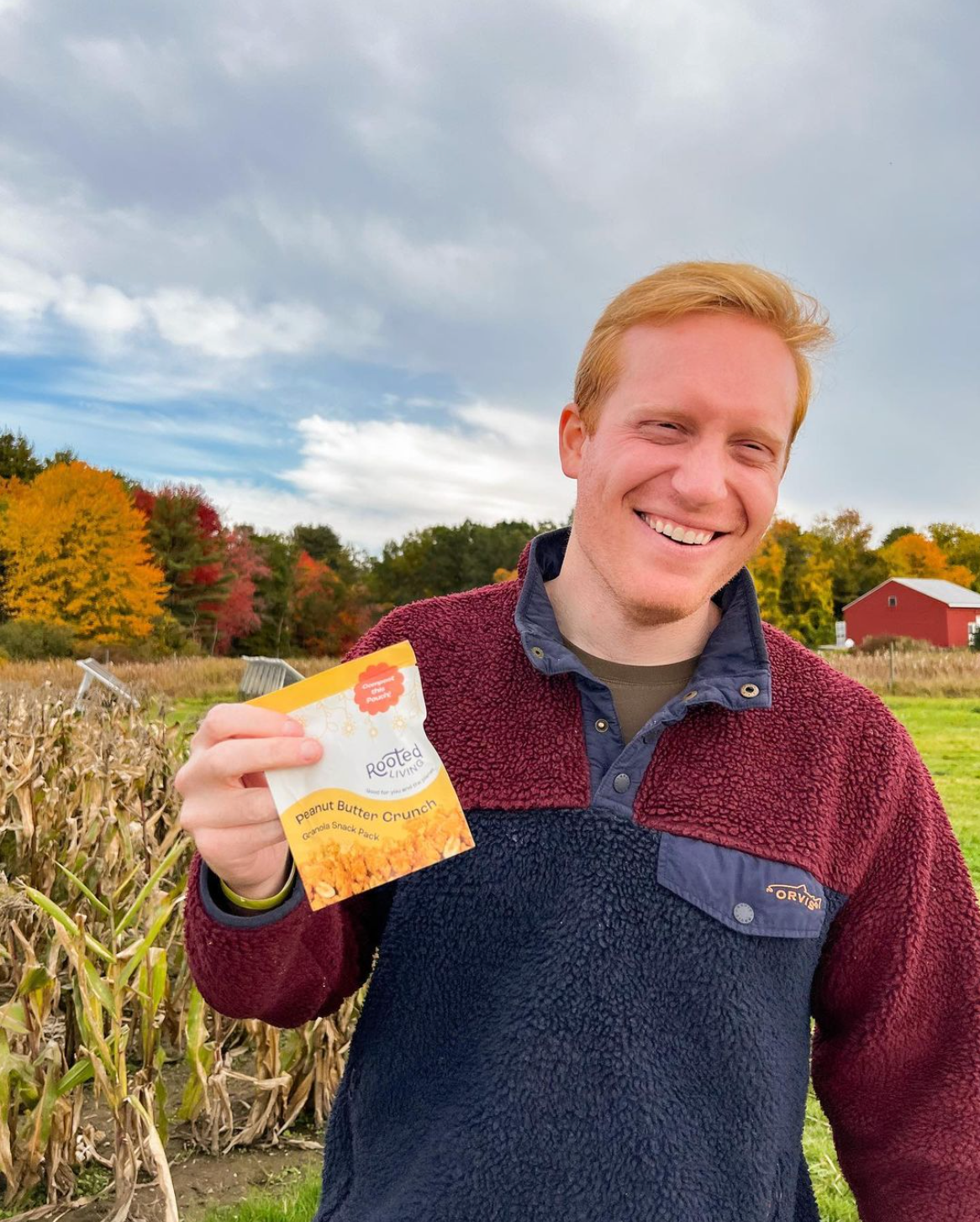
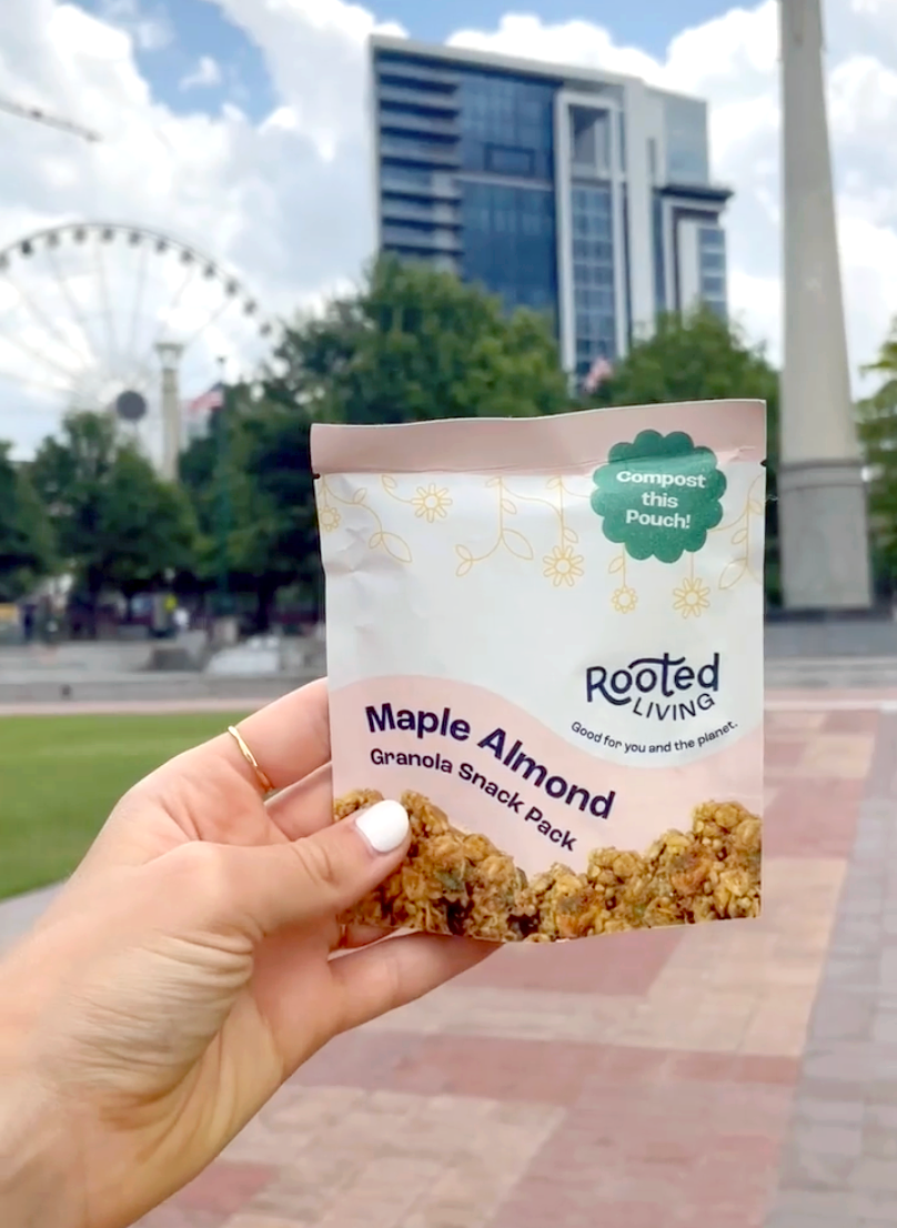
As the launch date approached, we began to layout the pouch designs for the initial two flavors of Rooted Living granola. We created a list of features and user stories that outlined who may be interacting with the products, as well as how and why they might be doing so. We started with paper sketches, and then moved to Figma and Illustrator where we spent multiple weeks tweaking and refining our designs based on feedback from our client.
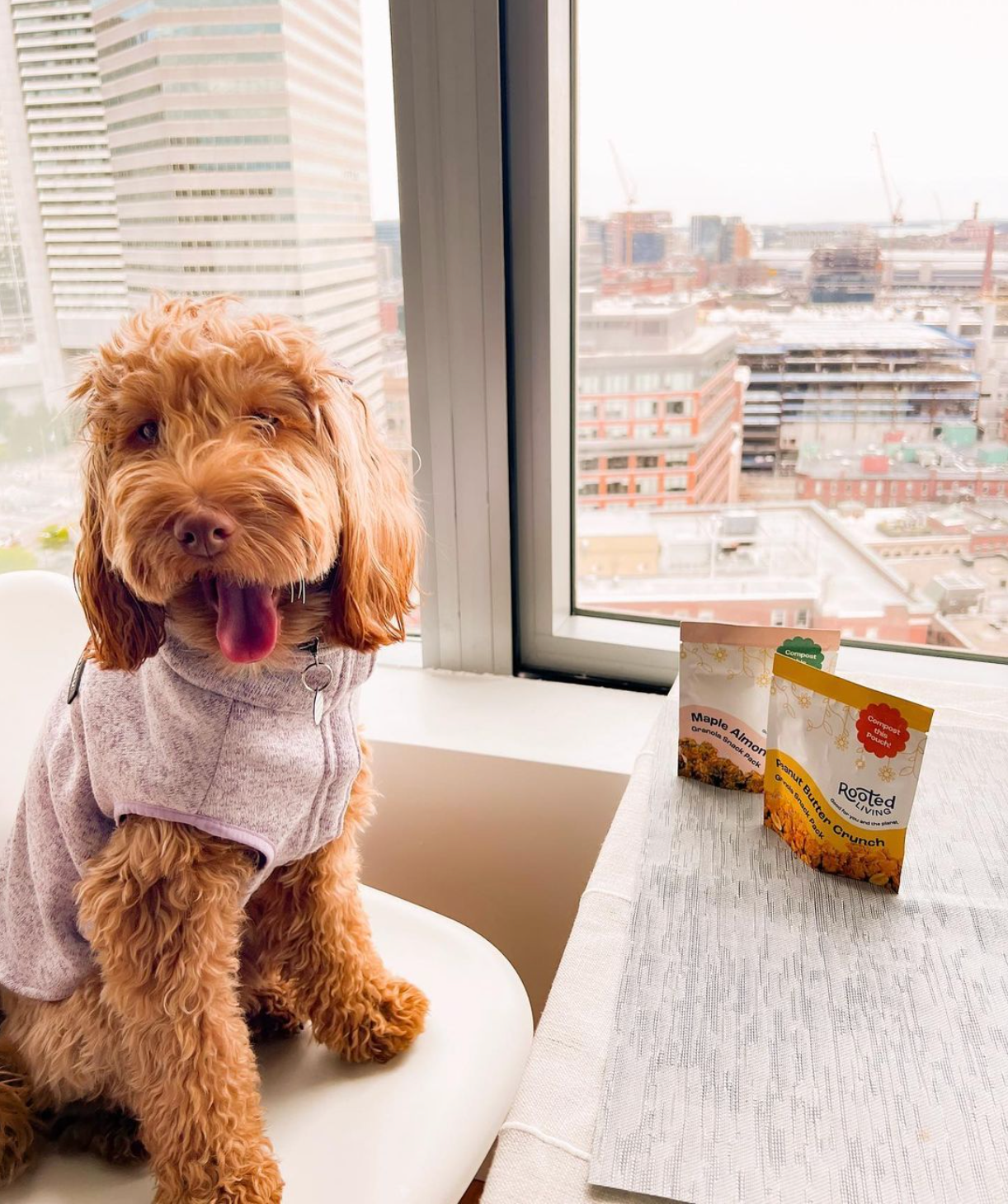
The Granola snack packs would evolve later; It became a project that I transitioned to work on solo with our client, after the launch of the brand and first two granolas, Peanut Butter Crunch and Maple Almond. I worked with our client’s package vendor and printer throughout the production process to ensure everything came out smoothly.
Brand Extension
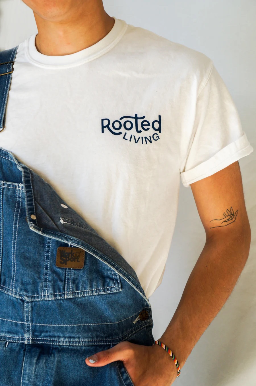
Lastly, headed up by some of the designers on our team, we created different merch items for the client, carrying the brand across different mediums and interaction points.
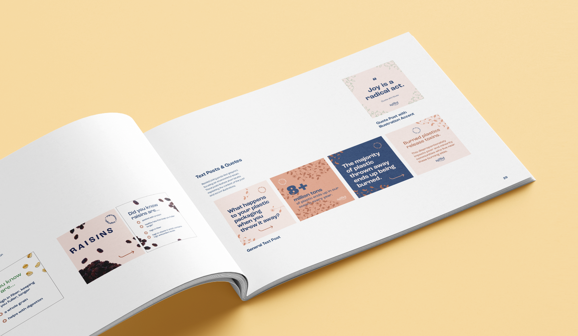
We also created design templates to be used for social media, specifically Instagram. The goal was to educate around different environmental issues, as well as teach the consumer about the different granola flavors and ingredients.
TEAM
My Role, Designer
Sam Marchesi, Project Lead
Josie Britt, Designer
Oliver Hu, Designer
Sam Steenstrup, Designer
Assets and imagery designed exclusively for Scout Northeastern and client.
All rights, title and goodwill remain the property of Rachel Domb and use of all assets is limited to designer’s portfolio only.

